
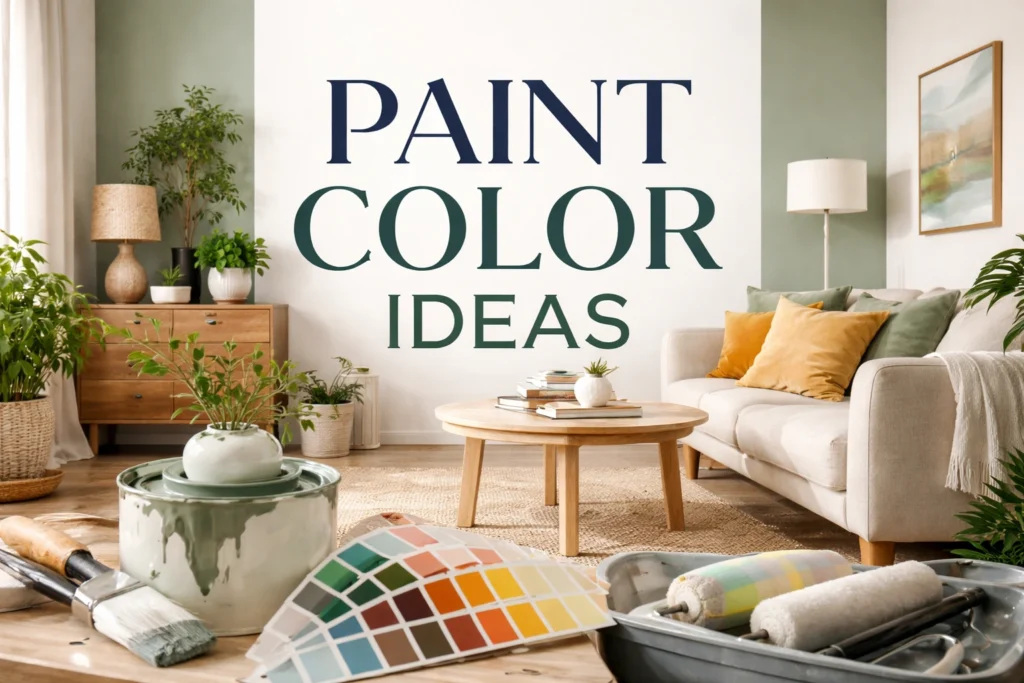

Paint Color Ideas That Transform Your Home
The Power of Paint in Home Design
Paint is one of the simplest yet most powerful tools in interior design. A fresh coat of color can completely change how a room looks and feels without requiring a major renovation. The right paint color can make a small space appear larger, brighten a dark room, or create a cozy and welcoming atmosphere. Many interior designers consider color the foundation of a well-designed home because it sets the tone for furniture, lighting, and décor. Whether you prefer modern minimalism or warm traditional spaces, thoughtful paint choices can instantly elevate your home and give every room a fresh, stylish personality.
How to Choose the Perfect Paint Color
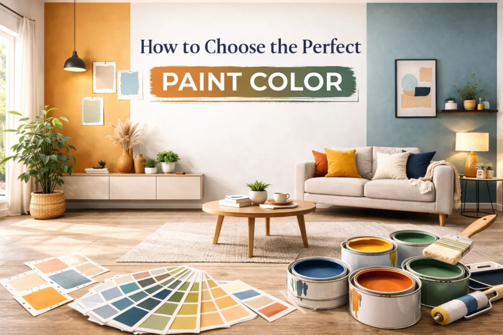
Choosing the perfect paint color may seem overwhelming because there are thousands of shades available. The key is to start with the mood you want to create in your home. Some homeowners prefer light and airy colors that reflect natural light, while others enjoy deeper tones that add drama and personality. It also helps to consider your existing furniture, flooring, and décor so the colors work together rather than compete. Interior designers often recommend testing a few samples on the wall before committing. Paint can look very different depending on lighting, time of day, and surrounding elements in the room.
👉 You might also like: Gramhir.pro AI Image Generator Review (2026) – Expert Guide
Understanding Lighting Effects
Light has a significant impact on how paint colors look once they are applied to your walls. Natural daylight often reveals the truest color, while artificial lighting can add warm or cool undertones. For example, warm LED bulbs may make beige or cream tones appear richer, while cool lighting can emphasize blue or gray hues. Always check paint samples during both daytime and evening lighting conditions.
Coordinating Colors With Decor
Your paint color should complement the overall design of your room. Consider your furniture fabrics, wood tones, rugs, and decorative accents before making a final decision. Neutral colors usually blend well with most décor styles, while bold colors can highlight statement pieces. When colors feel balanced and intentional, the entire room looks more polished and professionally designed.
Timeless Neutral Paint Colors
Neutral paint colors remain one of the most popular choices for homeowners because they create a clean, balanced look that never goes out of style. Shades like soft white, warm beige, light taupe, and subtle gray provide a versatile backdrop for nearly any design style. These colors allow furniture, artwork, and decorative accents to stand out without overwhelming the space. Neutral tones also reflect light beautifully, which helps rooms feel brighter and more open. If you plan to redecorate in the future, neutral walls make it easy to switch up your furniture or color scheme without repainting the entire room.
Warm Tones for Cozy Interiors
Warm paint colors are perfect for creating inviting and comfortable spaces. Shades like creamy beige, soft terracotta, warm caramel, and muted peach can make a room feel instantly welcoming. These tones work particularly well in living rooms, dining rooms, and bedrooms where you want a relaxed, cozy environment. Warm colors often pair beautifully with natural materials like wood furniture, woven textures, and soft fabrics. When used correctly, they can transform a plain space into a home that feels lived-in and comfortable. Even subtle warm undertones in neutral paint can make a noticeable difference in the overall atmosphere.
Cool Colors for a Calm Atmosphere
Cool paint colors are often associated with relaxation and tranquility. Shades such as soft blue, sage green, dusty lavender, and light gray can create a peaceful environment that feels refreshing and balanced. These colors are especially popular in bedrooms, bathrooms, and home offices because they encourage calmness and focus. Cool tones also tend to make rooms feel slightly larger because they visually recede, which is helpful in smaller spaces. When combined with natural light and simple décor, cool paint colors can give your home a clean, modern look while still feeling comfortable and inviting.
Bold Colors for Statement Walls
Bold paint colors can add personality and visual impact to any room when used thoughtfully. Deep navy blue, emerald green, charcoal gray, and rich burgundy are popular choices for homeowners who want to create a striking focal point. Instead of painting every wall a dramatic shade, designers often recommend using bold colors strategically. A single feature wall can add depth and character without overwhelming the space. When balanced with neutral furniture and décor, bold paint colors can make a room feel sophisticated and intentionally designed. The key is choosing a shade that complements the rest of your home’s color palette.
Accent Wall Ideas That Stand Out
Accent walls are one of the easiest ways to introduce personality into a room without overwhelming the entire space. By painting a single wall in a bold or contrasting color, you can create visual depth and highlight architectural features. Many homeowners choose accent walls behind beds, sofas, or fireplaces because these areas naturally draw attention. Deep shades like navy, forest green, or charcoal often work well for this purpose. Pairing an accent wall with lighter surrounding walls helps maintain balance while still allowing the statement color to stand out. When done thoughtfully, an accent wall can instantly elevate the style of your home.
Choosing the Right Accent Wall
Not every wall should become an accent wall. Ideally, choose a wall that naturally attracts attention when someone enters the room. This could be the wall behind your bed, the fireplace wall in your living room, or a wall with unique architectural features. Selecting the right wall ensures the accent color feels intentional rather than random.
Two-Tone Walls for Modern Style
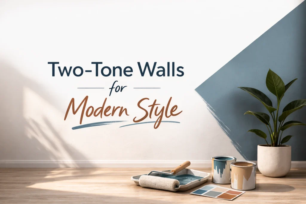
Two-tone wall designs are becoming increasingly popular because they add dimension and visual interest to a room. This technique involves using two complementary paint colors on the same wall, often divided horizontally or vertically. A common approach is pairing a darker shade on the lower portion of the wall with a lighter tone above it. This style works well in modern and contemporary interiors where clean lines and subtle contrasts are important. Two-tone walls can also help define spaces in open floor plans. With the right color combination, this technique creates a stylish layered look that feels fresh and sophisticated.
👉 You might also like: How E-Book Readers Work: Complete Technical Guide
Creative Ceiling Paint Ideas
Many homeowners focus only on wall colors and forget about the ceiling, often referred to by designers as the “fifth wall.” Painting the ceiling a soft complementary shade can add subtle character to a room. For example, a pale blue ceiling can make a room feel airy, while a slightly darker tone can create warmth and intimacy. In rooms with high ceilings, deeper colors can help the space feel more balanced. Even a subtle shift from bright white to a soft neutral tone can change how the room feels overall.A carefully painted ceiling adds a distinctive design element that can instantly enhance the overall look of a room.
Paint Colors for Small Spaces
Choosing the right paint color can make a dramatic difference in how spacious a room feels. Small rooms benefit from colors that reflect light and create an open atmosphere. Soft whites, pale grays, and light pastel shades are often used because they help bounce natural light around the room. However, darker tones can also work surprisingly well when applied strategically. A deep color on one wall can create depth and give the illusion of more space. The goal is to maintain visual balance while ensuring the room feels comfortable rather than cramped.
Using Light to Expand Space
Light-reflecting colors are especially effective in compact rooms. Shades like soft white, pale beige, and light gray can brighten the space and create an airy appearance. Pairing these colors with mirrors and good lighting further enhances the effect, making the room appear larger and more open.
Living Room Color Inspiration
The living room is often the centerpiece of the home, so the paint color you choose plays a major role in setting the overall tone. Many homeowners prefer versatile shades like warm neutrals, soft grays, or muted greens because they create a welcoming environment while still feeling stylish. If you want a more dramatic look, deeper tones such as navy or charcoal can add sophistication. The key is selecting a color that complements your furniture, lighting, and decorative accents. A well-chosen living room paint color helps create a space where people naturally feel comfortable gathering and relaxing.
Relaxing Bedroom Paint Colors
The bedroom should feel like a peaceful retreat where you can unwind after a long day. Paint colors play a major role in creating that calming atmosphere. Soft blues, muted greens, warm grays, and gentle lavender shades are commonly used because they promote relaxation and comfort. These tones help reduce visual stimulation, making the room feel serene and balanced. Neutral palettes also work well in bedrooms, especially when paired with soft textures and warm lighting. When selecting a bedroom paint color, focus on shades that make you feel relaxed rather than overly energized, ensuring the space truly supports rest and relaxation.
Fresh Kitchen Color Ideas
Kitchens benefit from paint colors that feel fresh, bright, and inviting. Light shades such as soft white, pale gray, and warm cream are popular choices because they make the space feel clean and open. For homeowners who want more personality, muted blues, sage greens, and dusty teal tones can add subtle color while still maintaining a calm atmosphere. These shades pair beautifully with natural wood cabinets, marble countertops, and modern hardware. Since the kitchen is often a social hub, choosing a color that reflects light and enhances the room’s brightness can make the entire space feel more lively and welcoming.
Trending Interior Paint Colors
Interior paint trends evolve each year, but certain colors continue to dominate modern home design. Currently, earthy tones such as clay, olive green, warm taupe, and soft terracotta are gaining popularity because they bring a natural and grounded feeling indoors. At the same time, deep dramatic shades like navy blue and charcoal gray are being used to create elegant feature walls. Many designers are also embracing muted pastels and dusty tones that feel sophisticated rather than overly bright. These trending colors allow homeowners to introduce modern style while still maintaining a timeless and comfortable living environment.
Paint Color Mistakes to Avoid
Even with the best intentions, homeowners sometimes make paint choices that don’t work well in their space. One common mistake is selecting colors directly from a paint chip without testing them on the wall. Different lighting conditions can significantly affect how a paint color looks in a room. Another mistake is choosing shades that clash with existing furniture or flooring. It’s also important to avoid using too many bold colors in one room, as this can create visual chaos. Successful interior color design usually involves balance, contrast, and harmony. Taking the time to plan carefully can prevent costly repainting later.
Testing Colors Before Painting
Testing paint samples before committing to a color is one of the most important steps in the process. Apply small patches of your chosen shades on different walls and observe them throughout the day. Natural sunlight, evening lighting, and surrounding décor can all influence how the color appears. This simple step helps ensure you choose a color you’ll love long-term.
Conclusion
Selecting the perfect paint color can totally change the appearance and atmosphere of your home. From calming cool tones to bold statement colors, the right shade can enhance lighting, highlight décor, and create the mood you want in every room. Whether you prefer timeless neutrals, trendy earthy shades, or creative accent walls, thoughtful paint choices make a big difference. By testing colors, considering lighting, and matching shades with your interior style, you can create a home that feels both beautiful and comfortable.
FAQs
1. What paint colors make a room look bigger?
Light shades like soft white, pale gray, and light beige reflect more light and help a room feel more open.
2. What is the best paint color for a living room?
Neutral colors like warm gray, beige, and soft green are popular because they work well with most décor styles.
3. Should every room in a house be the same color?
No, but using a consistent color palette helps maintain visual flow between different rooms.
4. Are dark paint colors good for small rooms?
Yes, when used carefully, they can add depth and create a cozy, stylish atmosphere.
5. How many paint colors should be used in one home?
Most designers recommend sticking to three to five main colors for a balanced and cohesive look.
✨ Got value? Let’s keep the momentum, follow Dympigal